Parking Structure & Viaduct
Project number: 003
Year: 2014
Program: Parking Structure / Viaduct
Location: Oslo, Norway
The project is the thesis project of Christopher Sucarrat Lunde, presented at KADK, Copenhagen, in 2014. It was made as a polemic against a suggested plan by the leading green political party (De Grønne) to prohibit cars in the city center. This plan is now implemented. The critique was not aimed toward the ambition of creating a car-free center, which seemed like a much-needed idea. On the contrary, the critique was towards the seeming disinterest of the party in finding a solution for the people that would still require a car because of how the city of Oslo has been planned for centuries. That has resulted in an extensive urban sprawl and a situation where managing a family without a car seems unsolvable for most families living in these dispersed areas of one-family houses. The question then becomes; how can we confront this with a solution that manages the cars from the suburbs driving into the city center? How can architecture be part of this change?
The project took the form of a kilometer-long parking garage. The parking is atop the central station, with circulation cores connecting each train platform. The idea is that the citizens would park their cars in the parking structure directly connected to the main highway into Oslo. They would then take the stair or elevator to the train platforms to access the main bus and metro stations. Placing the parking structure this way would facilitate a completely fluid movement from the individual dwelling in the suburbs into the city without congesting the city center. Keeping the city center car-free, but at the same time provide a solution for the car.
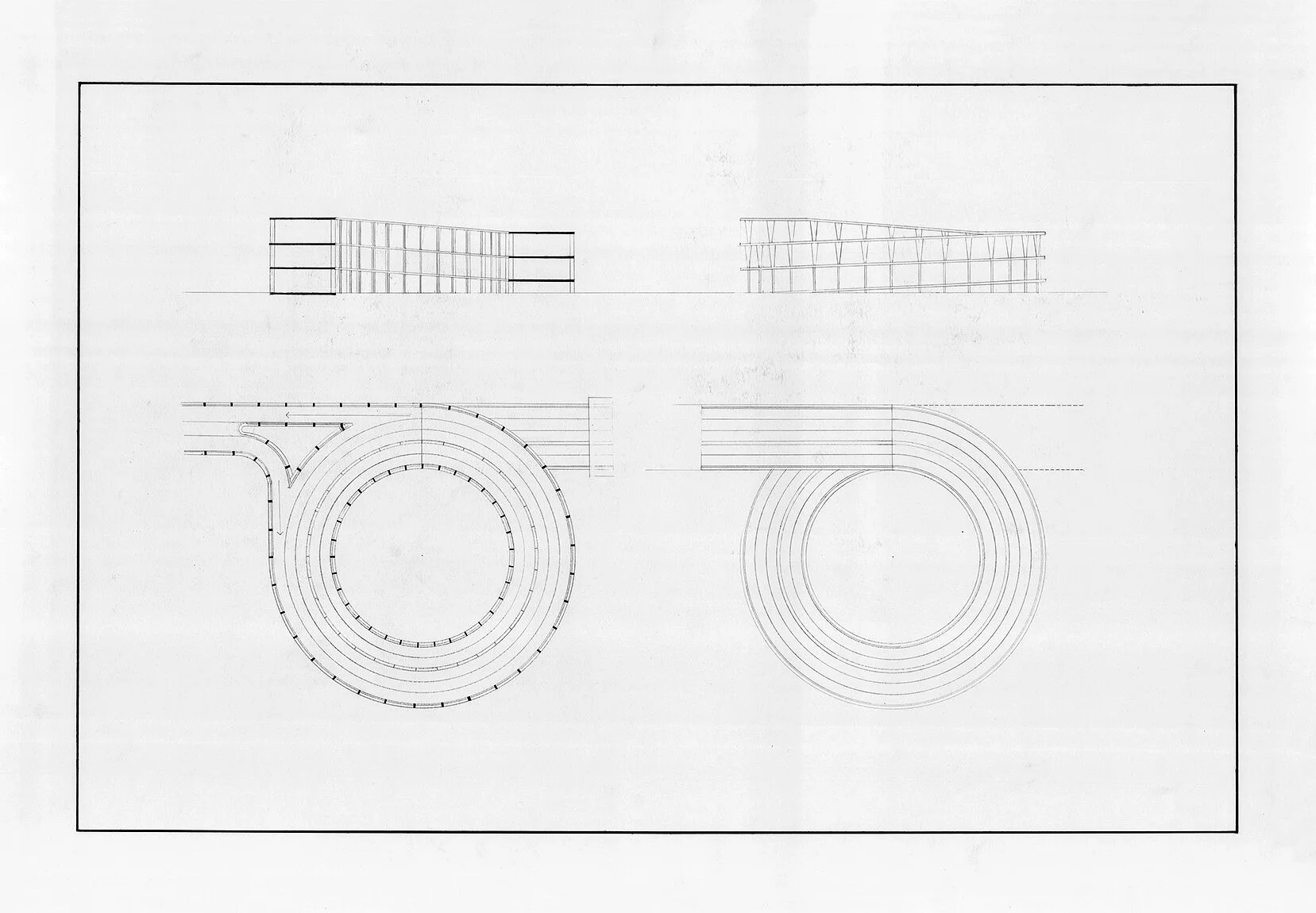
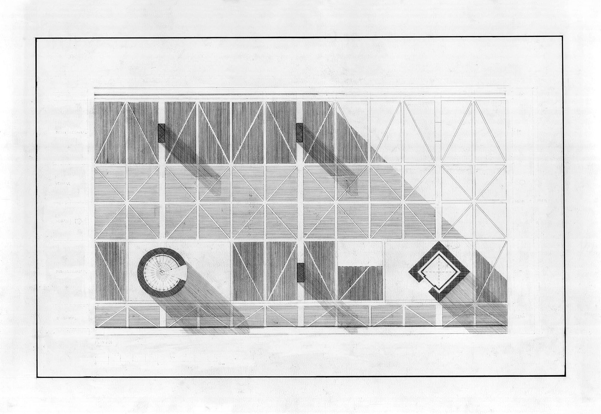
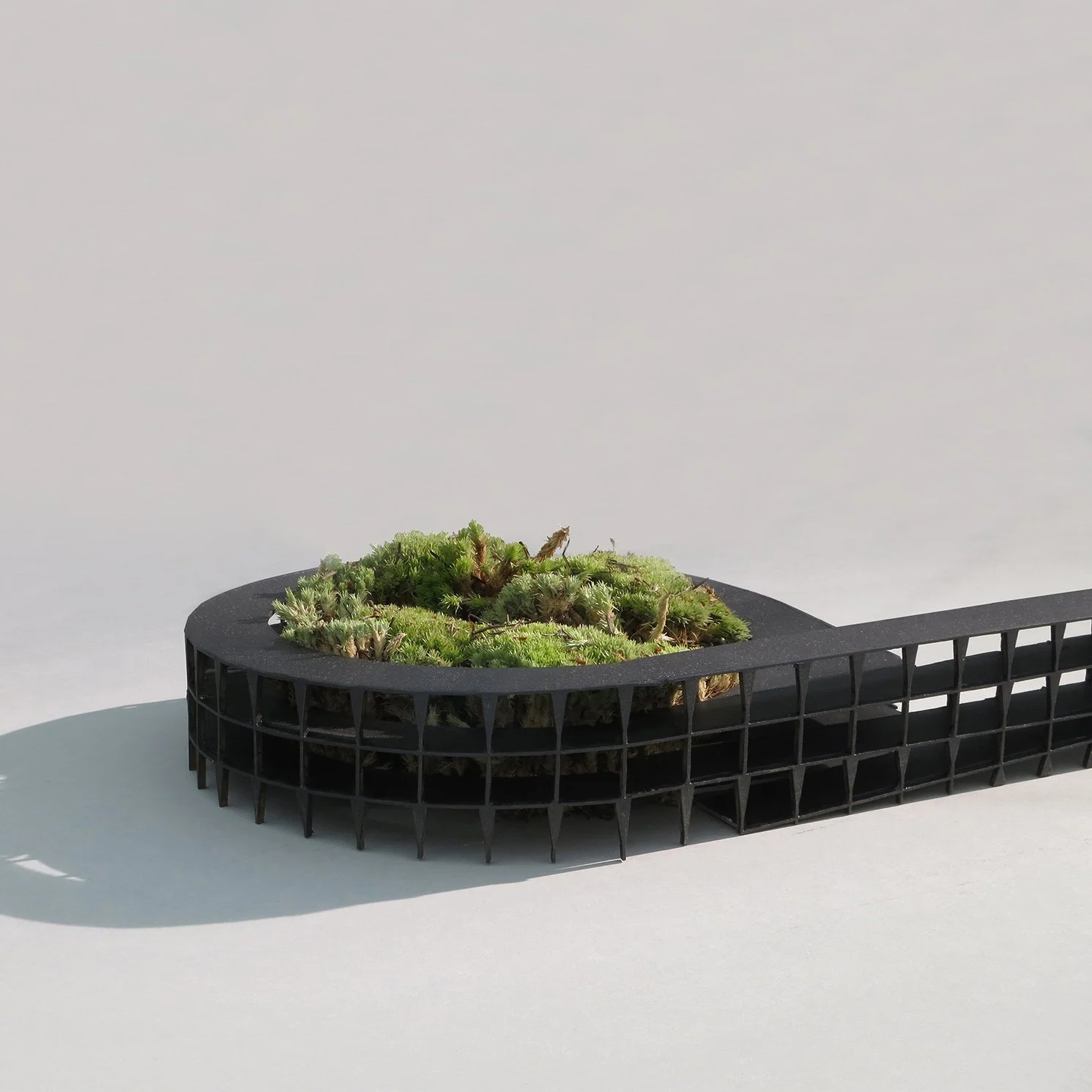
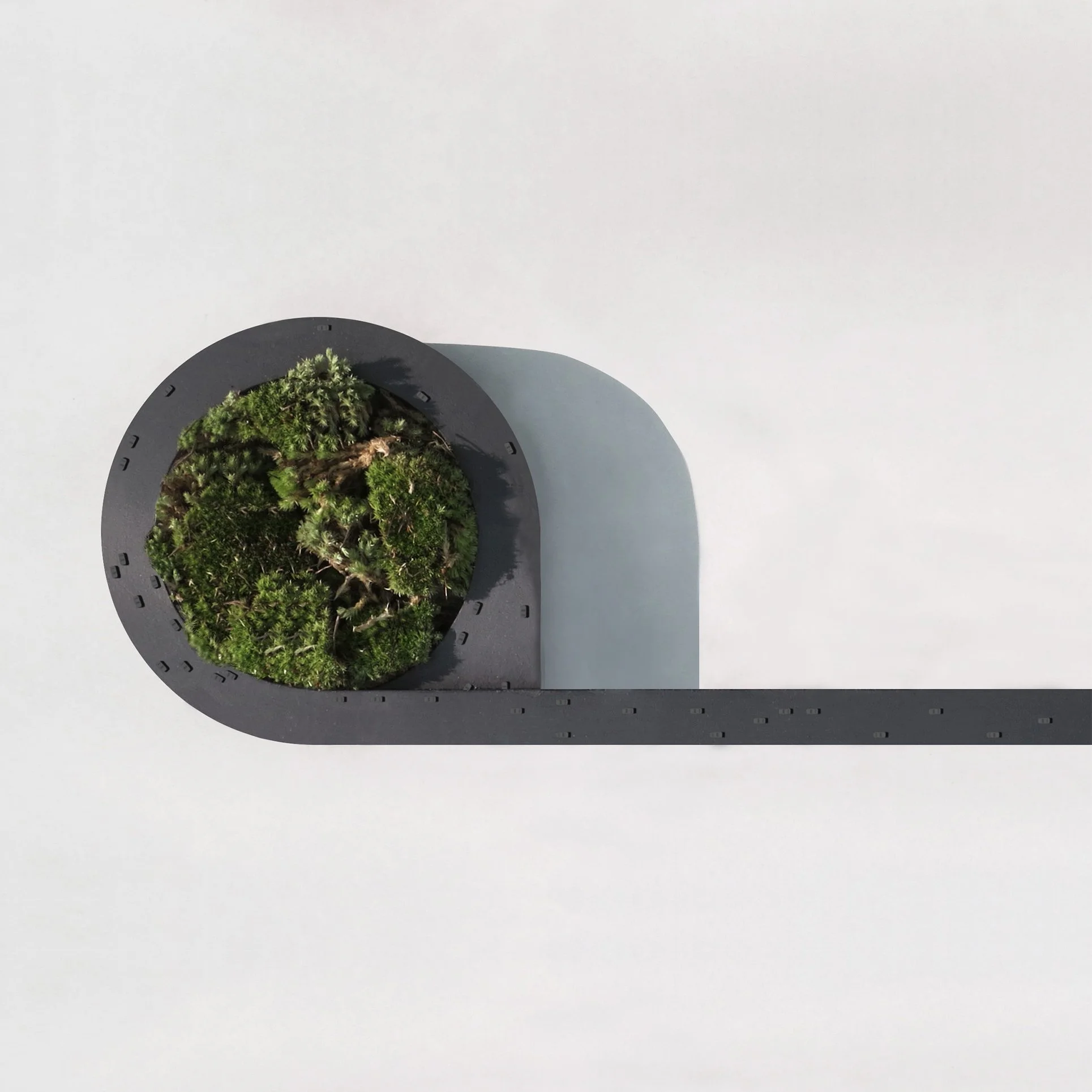
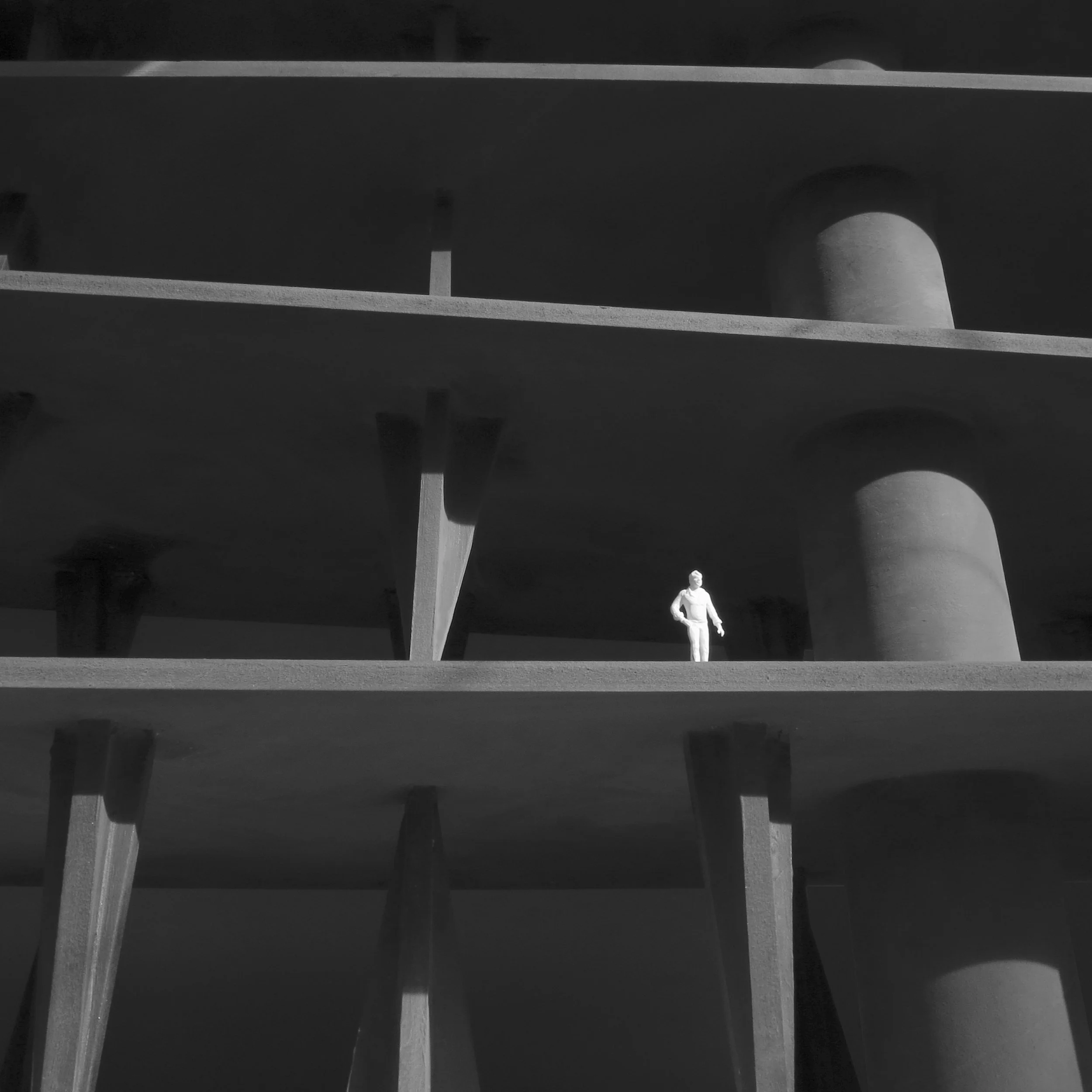
The parking is planned in an almost mechanical fashion. Depending on the possibilities for a foundation on the ground, there is a column for every four or fifth parking spot. The columns are made as thin as possible to save space for the parking spots. The elevator takes the form of a square that is rotated 45 degrees, while the staircase takes the form of a cylinder. Design is absent. These forms are the most efficient and optimized forms taking into consideration the task they have to solve. Once established, this system of columns and cores is duplicated throughout the one-kilometer-long Parking Structure. The road on top of the structure ends in a viaduct that spirals down to the main highway, going into a tunnel underground. In the middle of the spiraling viaduct, there is a forest. The forest represents the opposite. The city's central parking facility allows the rest of the city to be bathed in lush vegetation.
Abstraction as an ideal / The word abstraction derives from the latin verb abstrahere, implying the pulling away of something. Abstrahere is composed of the two latin words: ab-, meaning "off" and trahere, "pull" or "draw". The ideal for this project was to literally “pull off” anything that was not directly related to the pure articulation of void and solid. An architecture that has no cultural references, no intentional trace of technology, no iconography, and no tectonic or formal exuberance - pure abstraction.
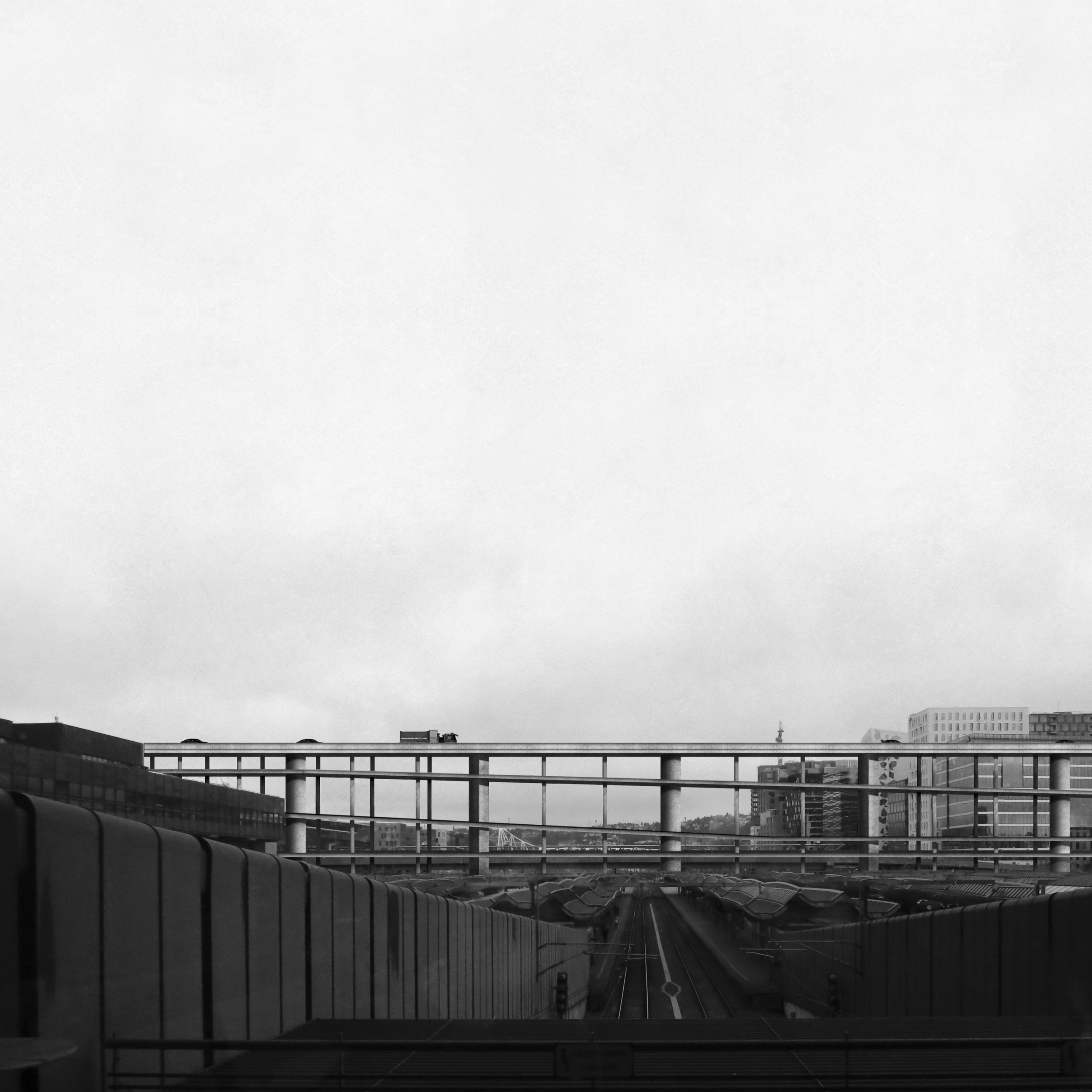
Perspective / The Parking Structure & Viaduct seen from the main lobby of the Central Station (Oslo S).
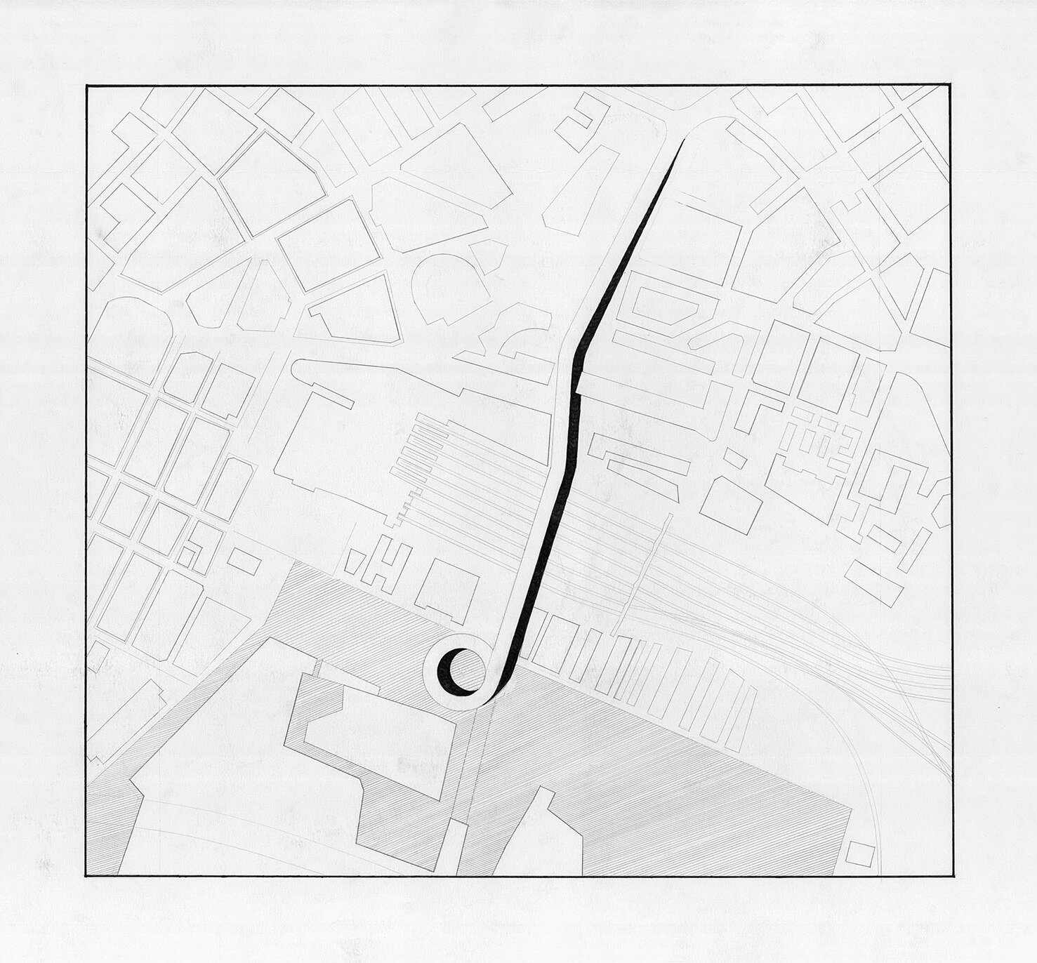
Siteplan / The parking structure in relation to the Central Station in the middle and the Opera next to the spiraling viaduct towards the south.
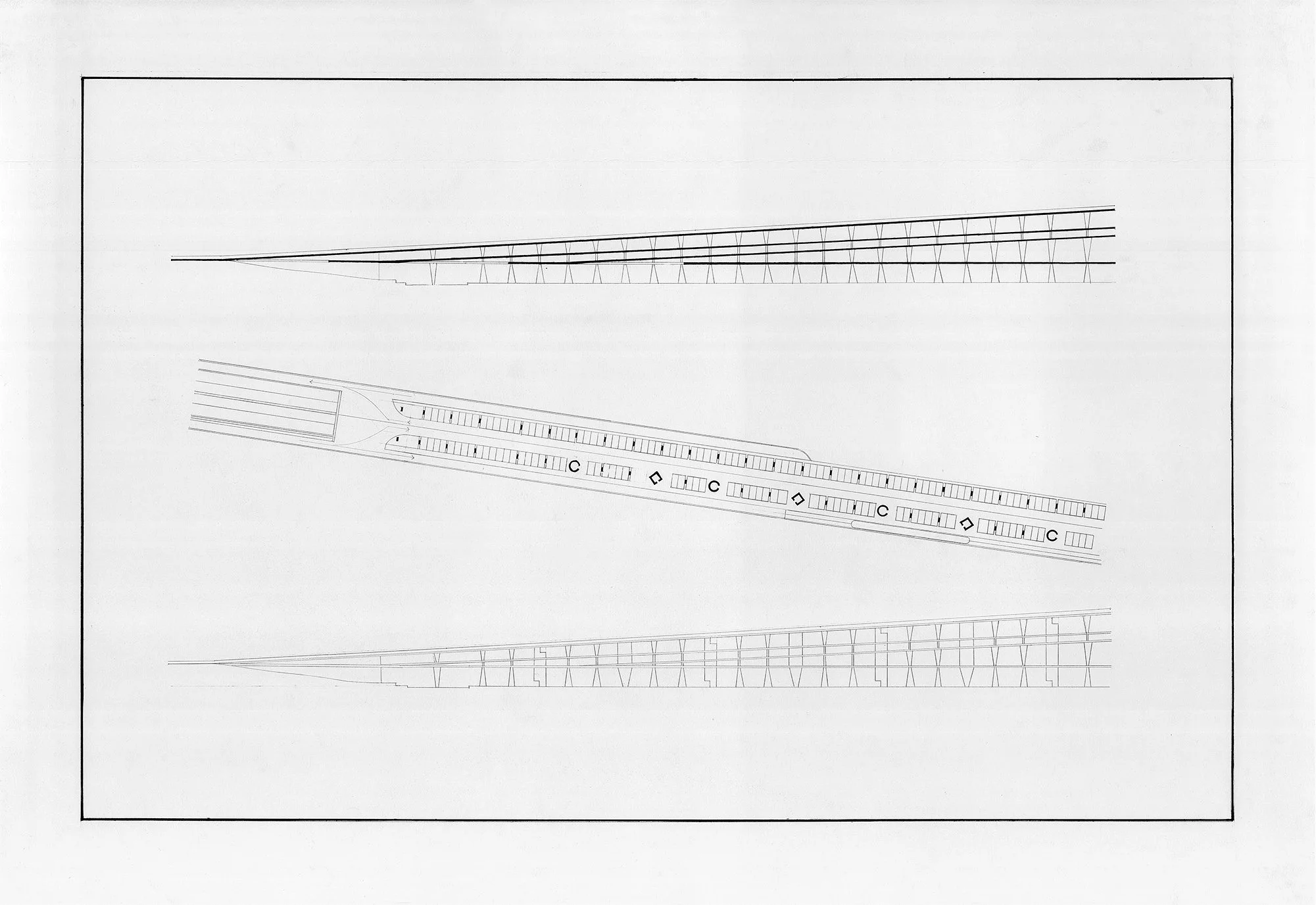
Plan / Section / Elevation 1:500 / Northern part of the parking structure.
Plan / Section / Elevation 1:500 / Middle part of the Parking Structure.
Plan / Section / Elevation 1:500 / The viaduct in the southern part of the parking structure.
Plan 1:50 / Detailed plan showing the two circulation cores, the thin columns, and the pedestrian pathway next to circulation cores.
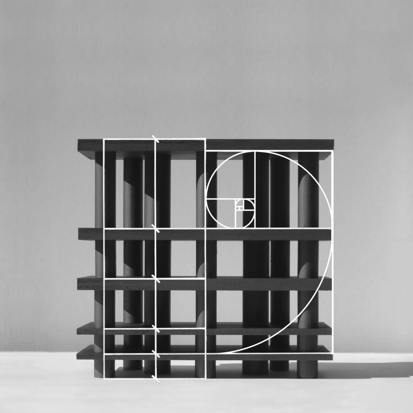
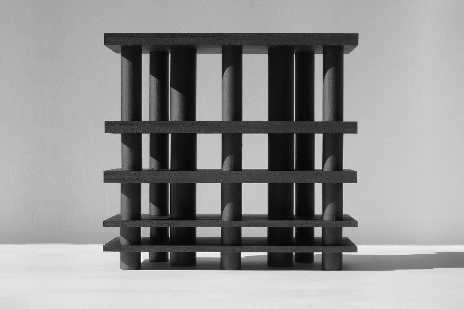
Conceptual model / Scale: 1:100 / Wood painted in graphite grey. The idea of the model is that the circulation cores are hidden within the “columns”, and were the spatial experience has the archaic feeling of moving between solids without any other visual disturbances. The black/grey graphite color also dims down the daylight, making the spatial experience as calm as possible.
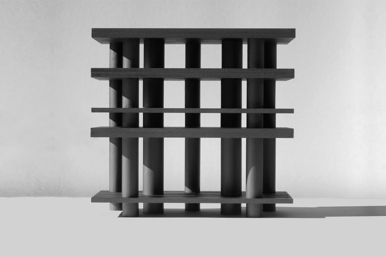
Conceptual model / Scale 1:100 / Wood painted in graphite grey. Model showing how the character of the building changes by only changing the proportional relation of the floor slabs.
Conceptual Model / Scale 1:100 / Wood painted in graphite grey. More flexible configuration of floor slabs.
Model 1:500 / The viaduct with the forest in the middle.
Model 1:500 / The viaduct seen from above.
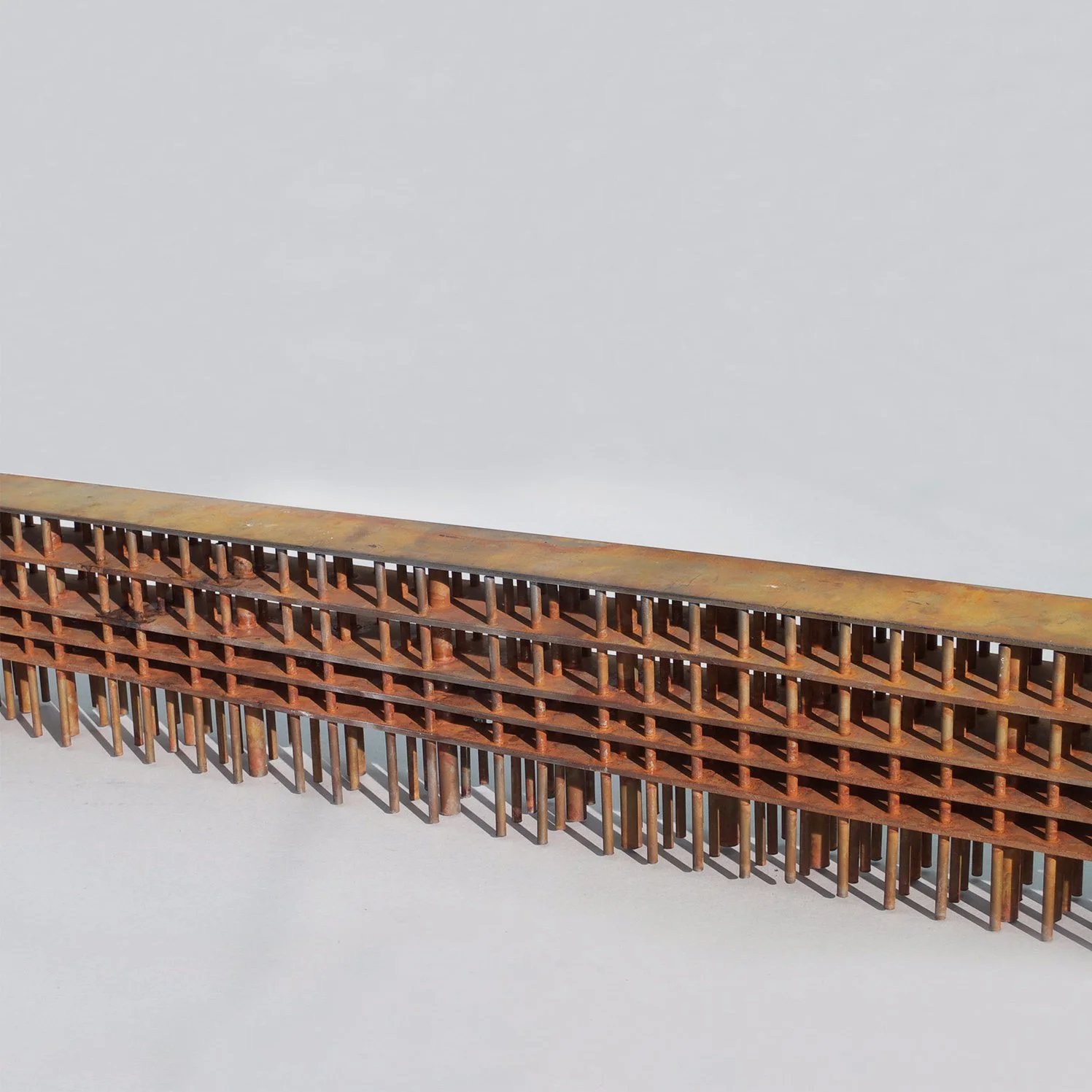
Sketch Model 1:500 / Steel model, manifesting the importance of a strong material presence once the formal language of the architecture is reduced to a minimum.
Sketch Model 1:200 / Pigmented Plaster.
Perspective / View from one of the top floors with the round circulation core to the left.
Model 1:50 / The parking structure seen in elevation.
Perspective / Parking structure seen from street level.
Model 1:50 / Perspective view were the parking structure is seen from street level.
1:1 Mock up / Alternative surface treatment.

