Café Copenhagen
Project number: 013
Year: 2018
Type: Café Table
Size: 1 m2
Client: Private commission
Café Copenhagen is, first and foremost, an idea. The idea consists of an architecture reduced to its bare necessity to stand up. The typology of the table is in its most crude state, defined by a table plate and four legs that are needed to support this table plate. In the Café Copenhagen table series, the articulation of these members and their tectonic articulation is reduced to almost nothing. There is no sophisticated joint, and the only hint that the table is designed is that the legs have a slight inclination, making them thinner towards the ground. As a sculptural shape, the table is as generic and ready-made as possible.
The idea is; what happens with a generic, ready-made object when treated as a three-dimensional painting. This thought is a variation of an idea that applies to several of our projects. These projects try to understand how architecture could look if it were accessible to all. The design is fundamentally a thin layer of paint. That allows us to create a series of objects that cost very little to produce. These objects, with their polychromatic character and joyful attitude, are also meant to have a radiant and positive effect on their surroundings, reminding us that design is also about spreading joy and that it can direct our mood in a specific direction.
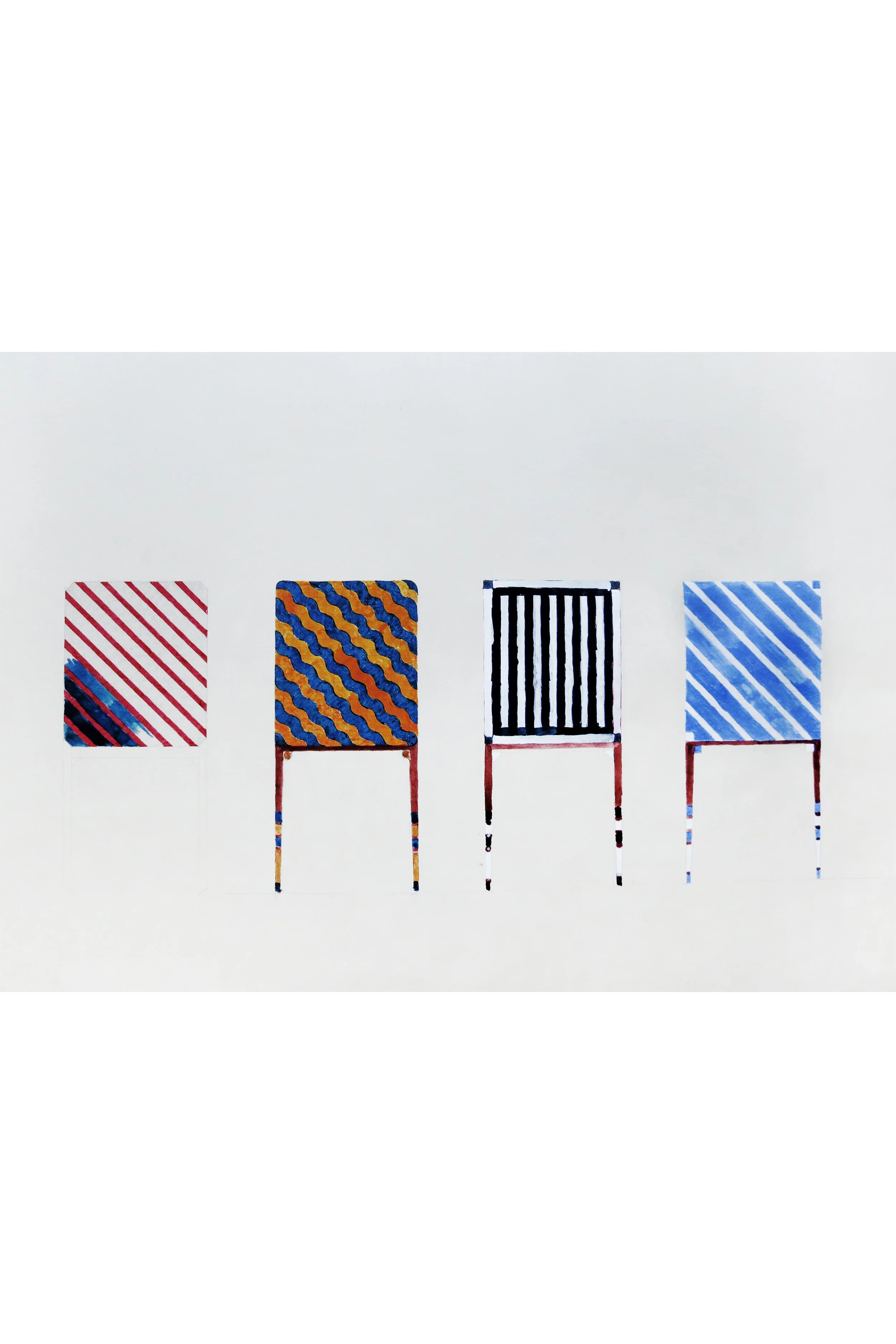
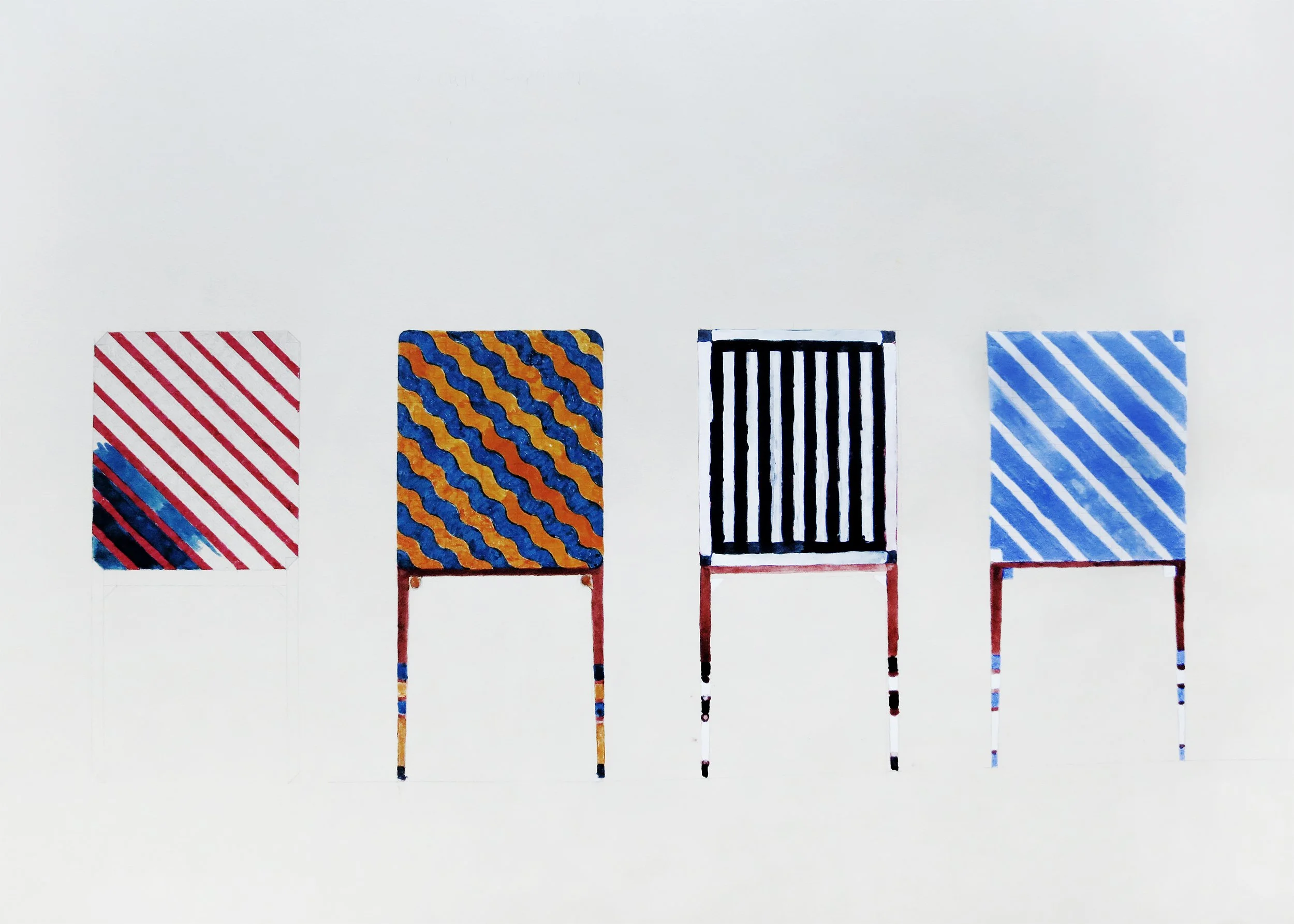
The tables presented in the drawing represented Copenhagen's two leading football teams, F.C. København and Brøndby IF. The table legs are painted like the socks of football players. The black and white table represents the referee. The blue and red stripes do not belong to a football team, suggesting that the tables can incorporate other types of iconography typical of Copenhagen.
Oblique drawing (90°) / From the left: Blue & Red stripes, Brøndby IF, The Referee, F.C. København.

